Page 8 of 9
Posted: Mon Aug 08, 2011 12:49 pm
by Kiya
Forgot to add Grandad...thats a great 2nd effort in your creased photos, your ahead of me now

by doing/trying the 9 panel creased lines.

Posted: Mon Aug 08, 2011 1:14 pm
by Horus
Kiya wrote:I think I prefer the " flaming name " I don't get it with flames coming from lovely flowers or is my imagination not with me today

It is called lateral thinking Kiya,

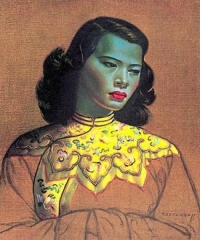
remember those weird pictures by the likes of Andy Worhol of Munroe, or the Bowler hatted man with an apple in front of his face? and who can forget the Blue Lady painting by Vladimir Tretchikoff,
everyone had a copy on the wall
Think laterally Kiya, think laterally

Posted: Mon Aug 08, 2011 4:04 pm
by Kiya
Dear Mr.Tutor its so cold up here today my brains frozen to think anything
I did a google on the bowler hatted man > Rene Magritte not sure I like his style but still some interesting reading.
Posted: Mon Aug 08, 2011 4:25 pm
by Bearded Brian
Well done G
H - thanks for all your efforts. I'll catch up at some time.
Posted: Mon Aug 08, 2011 5:25 pm
by Grandad
Blue Lady painting by Vladimir Tretchikoff, everyone had a copy on the wall
I didn't......
Posted: Wed Aug 17, 2011 3:25 pm
by Kiya
My first attempt with the " flaming pic "......I'm not really happy with it.....my fault I know

try as I might I just could'nt get the rounded/3D effect for the lettering to stand out more.
Back to the drawing board tomorrow

Posted: Wed Aug 17, 2011 4:33 pm
by Horus
I reckon that for a first attempt that is pretty good Kiya.
The knack of getting this effect to look good is the shape of the letters which must have a 3D look about them. Make sure that you choose a suitable font type that lends itself to looking a bit ‘block’ like, IMPACT is a good one for this exercise.
The next important thing is to set the depth and size of the chamfered appearance of the letters.
By double left clicking on the text layer (not the icon) you will bring up the appropriate dialogue menu.
In it you will see the option of BEVEL & EMBOSS amongst a list of many other options, you must again double left click on the words Bevel & Emboss and this menu changes slightly and gives you some further options.
Usually they are listed under the heading STRUCTURE and the important ones for you to change are DEPTH and also SIZE.
Look at this example to see how just changing these two settings can affects each of the letters in a different way. Each letter is in the same Font and the colours are identical, any visible variations are as a result of the changes described below

In all of the above letters the DEPTH has been kept the same (400%) but the SIZE has been changed in each one. Notice how with the depth set at 18 for the letter ‘K’ that there is just a slight chamfer all around the letters edges.
The next letter ‘i’ has had the SIZE increased to 25, notice that the edge chamfer is much larger and with it being a ‘Lower case’ letter it shows up more.
Now look at the ‘y’ and see how it looks much flatter, that is because I have reduced the SIZE back down to 10.
Finally the letter ‘a’ has had a very large chamfer added by increasing the SIZE up to be 40, it looks much darker and again the Lower case letter exaggerates the effect.
Hope that this helps.
Posted: Wed Aug 17, 2011 5:02 pm
by Kiya
Yes thanks Mr Tutor, shall be back on it tomorrow
Posted: Wed Aug 17, 2011 5:26 pm
by Horus
Posted: Fri Aug 19, 2011 3:54 pm
by Kiya
Now my 2nd attempt, for some strange reason I don't find this excercise so easy to do
but I've tried
[i

Posted: Fri Aug 19, 2011 4:40 pm
by Horus
Maybe because in my tutorial it is very hard to be precise about something’s, especially when it involves actions like telling you to erase a certain amount from certain areas and then adding just a bit of black here or there. It is all subjective and down to how you interpret what I have told you, so you will never get exactly the same result as I have with my own example.
However you have done very well and there is nothing wrong with it as far as I can see, you have obviously corrected the background colour to a solid Black which has improved it tremendously.
Your letters stand out quite well and they have a realistic ash effect at the top as if they are being burnt by the flames. Overall it is a really good effort considering that you are not working with exactly the same program as I am and there are bound to be some differences.
If I offered any constructive criticism to improve what you have done it would be as follows:
Remove the ash effect on both outside letters down the outer edges so that the red shows through completely across the bottom part.
Again erase just a little more ash effect in the centre area so that the ash effect takes on a slightly curved arching shape.
Use a small brush and add some slight blackening on the top outer corners to give a charred effect.
Generally the flames look good, but remove some of the bottom part of the flame between the Y and the A so that it seems to be leaping across the two letters nearer the top and not from low down on the right hand side of the letter Y.
Finally, clone in a bit more flame to be going upward from the top of the letter A.
However don’t worry too much about the final result, it is knowing how to do the effects that count and using the programme and so far you are doing great, the best results will come with experimentation and practice, but I can’t teach you that.
Posted: Fri Aug 19, 2011 5:37 pm
by Kiya
Thank you Mr.Tutor I shall have a third go....maybe 3rd time lucky
Posted: Fri Aug 19, 2011 10:43 pm
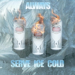
by Horus
As I said Kiya, it all depends upon how you use the knowledge that you gained from the tutorial, here is one that I lashed up as a beer advertisement using the technique just to give you some idea.
[
Posted: Sat Aug 20, 2011 1:26 pm
by Kiya
Oooooo thats brill
Mr. Tutor...............its toooooo cold today to have one
Posted: Sat Aug 20, 2011 4:26 pm
by Kiya
Had some fun today with 3rd attempt using different cracked paint,flames,text & messing around with different settings.
Looking again perhaps I should have moved the flames down a bit......oh well it was just another go

Posted: Sat Aug 20, 2011 5:09 pm
by Horus
I reckon you have got this cracked now Kiya
Posted: Sat Aug 20, 2011 9:28 pm
by Kiya
Cracked & on fire
Thank you Mr.Tutor
Posted: Tue Aug 30, 2011 2:20 pm
by Grandad
Sorry I haven't come back on this one after Horus kindly emailed the flaming name tutorial to me. (Many thanks H)
I am finding that neither PSE7 nor PSPx2 have the same degree of functions and control that yours Horus and Kiyas programs have.
In consequence I have not been able to match your results. The attempts have however taken me more into functions that I had not tried in the past so I am saving it all for the winter months to see if I can come up with something original.....(That would be a first
)
Posted: Sun Oct 30, 2011 8:43 pm
by LovelyLadyLux
Am bringing this topic back to the top cause now that the 'wet winter' months have settled in and I'm up to as much speed as I can be with my laptop I'm going to go through the lessons.
Anybody going to join me? (I know I was late to the last semester of classes and I apologize to the teacher)
Posted: Sun Oct 30, 2011 9:34 pm
by Horus
I just hope I can remember the tutorials if you need any help