Ad blocker detected: Our website is made possible by displaying online advertisements to our visitors. Please consider supporting us by disabling your ad blocker on our website.
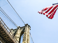
Roy wanted the name of the bridge down the brick work , do you think it looks ok ?
Do you know I had not noticed until you mentioned it
Personally I do not like it, mainly because it does not match the image, it looks too much like it has been added. As you know it is very difficult to add something to an image without it looking false.
Several things spring to mind: Firstly I would have thought that the lettering would be all upper case so that people would see it more easily (if it were real that is). Next the colour would need to be subdued enough not to be 'in your face' and stand out too much against the complete image, in other words you do not want your eyes to go straight to the name. Last but not least it needs to look as if it is attached to the brickwork, this is difficult to achieve and is best done by carefully adding some shadow on one side of the letters and maybe the base of the bottom one. Do this by adding it at around 70% to 90% very close to the letter edge and then drop to about 30% to 50% and 'stroke' a little more shadow after that until it looks OK. Not easy to achieve and be careful that you don't over do the effect, the idea is to make the letters look 'grounded' and not seperate (standing off) from the background.
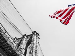
Ok here is the 1 from using the "mask layer" & adding the text all in Gimp.
I think if you look at the flag there is a big difference using the mask.............& I agree the text doesn't look right on the brick work so put it below allowing room for the pic to go around edge of canvas.
I was going to add a text with shadow but couldn't find how to in Gimp ?
Looks nice Kiya, I did have a quick play by downloading a copy of your image, but it is too grainy for me to try something out. If you like, drop a copy of your original into Dropbox (if its still on your PC use the last Dropbox 'Recovery Programme' folder that I shared with you) and I will have a look at it for you later today.
Well the image was a bit small Kiya so it was difficult to do a lot with it as it pixelated very quickly, but maybe this will give you some idea of the technique to use.
Note how I have tapered the lettering so that it better matches the perspective of the bridge pillars, also the top lettering is stepped back as at that point the brickwork is narrower than that below. The lettering is left looking a bit jaded as this adds to the sense of age to match the bridge and I have added shadow to the right side to ground the letters with the brickwork, the image is then sharpened a little after adjusting the lighting and shadows, not as good as I would have hoped but hopefully it shows the method I was telling you about. Both files are in the Dropbox if you want them.
Horus.... sent the photos to Roy last night & he thinks it's great ! with the writing etc...........only thing I haven't told him yet that it was you who did it now got myself in a pickle till I tell him because.................he wants to give the photo a complete different name unique to him & him only.
@Kiya I think we can keep that little secret between ourselves we can't have Roy thinking his mum is not Superwoman now can we?
@Jay, you have missed the point, the letters are supposed to look as if they have been there for donkeys years, maybe since the bridge was built
Or knowing you Jay you are just winding me up
Horus I double checked the original coloured photo & the bird has a red eye , it doesn't look like a mistake when photo was taken but I will try to lighten the body
As few of you pop over to the mother ship - Luxor4U - these days, or if you do you just view and not comment, I thought I'd pop over here to say hello.